More Than a Message: How Safety Signs Shape Safer Habits
- 28 Jul 2025
- Articles
Safety signs are everywhere—on doors, fences, roads, stairwells, loading bays. They tell us where to stand, where not to park, when to stop, and what’s off-limits. But these signs aren’t just there for show. Over time, they help us internalize rules and develop habits that keep people, property, and operations safe.
The most effective safety signage does more than deliver instructions—it influences behavior. Whether you're managing a construction site, a public car park, or the hallway of a school, the right signage helps prevent confusion, accidents, and even legal problems. It works not because people are forced to comply, but because the signs become part of their everyday pattern of behavior.
You see this effect clearly with something as simple as no parking signs. At first glance, they seem straightforward—don’t park here. But their placement, clarity, and consistency are what actually prevent access blockages, enforce fire safety zones, and protect pedestrian paths. When a driver sees that sign enough times in the same location, “don’t park here” becomes second nature.
Let’s look deeper at how safety signage helps form safer habits and why visibility, design, and placement matter more than you think.

Photo by Kelly
Why Signs Work: A Quick Look at Habit Formation
Habits are built through repetition. In psychology, this is called the “cue-routine-reward” loop. A cue triggers a behavior (the routine), and if there’s a positive result (the reward), we’re more likely to repeat that behavior. Safety signs act as cues. Every time someone sees a “Caution: Wet Floor” sign and walks around the puddle, they’ve followed a loop that protects them and reinforces a safe response.
Now apply that to a workplace. If employees are used to seeing “High Voltage” or “Protective Gear Required” signs at the right entry points, they start to associate those areas with higher risks and adjust their behavior automatically. The more consistent and visible the signs are, the more effortlessly those safety responses become.
So it’s not just about posting a sign—it’s about using that sign to guide people into safer actions, day in and day out.
Visibility Isn’t Optional—It’s Foundational
Let’s be honest: people are busy, distracted, and often looking at their phones. A safety sign that blends into the background or is blocked by a tree branch doesn’t stand a chance. Visibility is the first test your signage must pass.
Here’s what makes a safety sign visible and effective:
-
Contrast: Use bold colors (like red, yellow, or black) with high contrast against the background.
-
Font size: Readable from the expected distance (small font = missed message).
-
Symbols: Icons transcend language barriers and are processed faster by the brain.
-
Lighting: Signs in dark hallways or outdoor areas need to be reflective or backlit.
-
Placement: A perfectly designed sign won’t help if it’s not placed where the decision happens.
Take a common mistake: a no parking sign placed too high on a wall or hidden behind a hedge. A driver might genuinely not see it—resulting in blocked access or emergency vehicle delays. That’s a problem signage is supposed to prevent.
Consistency Builds Compliance
If you’ve ever walked through a shopping center and seen five different styles of signage telling you where not to go, you’ve experienced what inconsistency looks like. It’s confusing. It makes people second-guess rules. And worst of all, it opens the door to non-compliance.
Consistency means:
-
Using the same icon or symbol for a specific type of message (e.g., the same red circle with a line for all “no” actions).
-
Placing signs at the same height and format in similar areas.
-
Choosing standard language (“No Entry” instead of “Do Not Go Through This Door”).
When signs follow a pattern, people don’t have to stop and interpret them. Their brains recognize the pattern and respond faster. Over time, this turns into automatic behavior—and that’s when habits start to stick.
Repetition and Familiarity: Why Habits Need Reinforcement
One sign won’t fix anything. But repeated cues in strategic locations will.
Think about a warehouse floor. If a “Caution: Forklift Area” sign is only at the entryway, a worker might forget about it once inside. But if the same sign appears at intersections, aisle openings, and blind corners, it keeps the risk top-of-mind.
This repetition matters in public spaces too. “No Parking” signs placed every 10 meters along a loading bay or fire lane eliminate the excuse of “I didn’t see it.” It also helps authorities enforce the rule fairly—after all, you can’t argue with six signs in plain view.
And if a driver regularly visits that space, the routine becomes embedded: pull in, drop off, don’t park here. No second thought. Just safe, reliable behavior.
Design with Behavior in Mind
Not all signs are created equal. Some are just more effective at shaping behavior because their design aligns with how people think and move.
Here are a few design tips drawn from behavioral psychology:
-
Use action verbs. Signs like “Keep Clear” or “Do Not Block Driveway” are direct and easier to act on.
-
Highlight consequences. Wording like “Tow Away Zone” or “Danger: High Voltage” reinforces the risk.
-
Simplify. Too many words? People won’t read them. Stick to the essentials.
-
Use universally understood symbols. The red circle with a slash is globally understood to mean “no.”
The simpler and faster the message hits, the better it works—especially in high-risk or high-traffic environments.
Bad Signage Has Real-World Costs
Let’s talk consequences. Poor signage isn’t just a design fail—it can lead to real problems:
-
Blocked emergency access: Unclear no parking signs can delay fire crews or ambulances.
-
Legal liability: An injured visitor may claim they weren’t warned if signage is missing or unclear.
-
Workplace accidents: Confusing or hidden signs can cause preventable injuries.
-
Lost productivity: Employees may need repeated verbal reminders when signage doesn’t do its job.
Replacing or upgrading signs might seem like a minor maintenance task, but it’s often one of the most affordable ways to improve site safety and efficiency.
When and Where to Update Your Signs
How do you know it’s time for a signage refresh? Here are some clear signals:
-
Faded or cracked lettering: If you can’t read it from 10 feet away, it’s not doing its job.
-
Blocked or poorly placed signs: Shrubs, doors, or storage items shouldn’t hide signage.
-
Too much clutter: A wall of signs with no visual hierarchy is overwhelming.
-
New site changes: Renovations or traffic flow adjustments should trigger a signage review.
If you’re not sure, walk through your space as if you’ve never been there. Would you know where to go? What to avoid? Where to park? Where not to?
Chances are, your signage will answer those questions—or fail to.
Start with the Signs People See Every Day
If you want to shape safer habits, start with the signs that get the most exposure. Entryways, parking areas, stairwells, break rooms—these are all ideal touchpoints for reinforcing safety routines.
Make those signs clear, consistent, and intentional.
A well-placed no parking sign doesn’t just prevent an inconvenience. It keeps fire lanes open. It allows delivery trucks to do their job. It keeps pedestrians safe. And every time someone obeys it without thinking? That’s a habit doing its work.
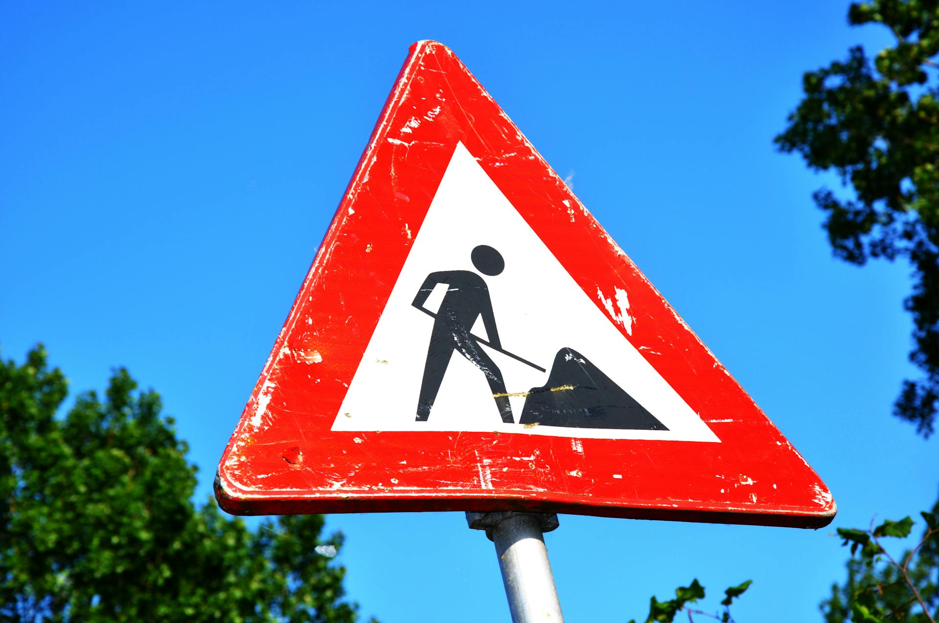
Photo by Mabel Amber
Final Thoughts: Signs as Silent Safety Partners
Great safety signage is like good lighting—you only notice it when it’s missing. But the best signage does more than deliver rules. It becomes part of the environment, shaping choices and promoting safer routines without a word being spoken.
When signs are visible, consistent, and thoughtfully placed, they don’t just inform people—they influence them. And that influence can mean fewer injuries, fewer disruptions, and fewer risks for everyone involved.
So whether you’re managing a job site, a school, a warehouse, or a car park, take your signs seriously. They’re not just compliance tools—they’re behavior-shaping, habit-forming, risk-reducing assets.