Sign In

No matter what designer you are, whether you work in fashion, apparel, textiles, soft goods etc., you need to make sure that colour cohesively translates across different materials, media (e-commerce imagery, packaging etc.) and within the retail environment. Basically, that you have colour consistency throughout your whole process, from ideas stage right through to completion.
Whilst this is not easy, colour consistency is achievable, if brands and companies adopt the right practices and tools. This way you can ensure that colour stays consistent from the initial idea right through to the product being sold on the shop floor (or e-commerce site).
Digital and physical elements in the workflow
Designers need to identify the intersections of physical and digital design elements within the whole creative process and workflow. You may be thinking that you don’t need to consider digital as design happens using entirely physical processes. In this mobile-first, digital content consuming world, brands will miss out if they are not representing physical items accurately in a digital purchase environment. Customers are less likely to return products when they appear the same physically as they did digitally or in print.
The facts don’t lie…
According to a study carried out by the Pantone Color Institute, 86% of designers when asked have little or no knowledge of the manufacturability of colour in their workflow. This is not good as brands should be giving detailed instructions to those responsible for producing the final product and conversely should also understand which colours can be achieved on the materials used. There are tools to assist in closing this “knowledge gap” between designers and those in production.
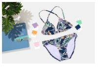
In fashion it’s all about the material…
In most cases fashion designers start by physically playing around with palettes and experimenting how different colours appear on different types of material and fabric by using cotton swatches for example. If designers use colour references when they are building their palette and working with inspiration, they will be able to easily and more accurately communicate with the production. They or the manufacturer can even access the spectral data of the colour (which is akin to its DNA) or the dye or pigment formulation - this will help speed up the whole initial production process.
Integrating digital standards
Not many brands utilise online tools that drive appearance (colour, texture, patterns etc.) However, there are digital colour standards that allow you to see how colour appears and changes on the final material. If used early in the creative process, brands will have more success in ensuring a product’s colour consistency.
Introducing Pantone…
To achieve the above we recommend using Pantone. Many of you will have heard about Pantone, but just in case you haven’t, this company provides a universal language of colour that enables colour critical decisions through every stage of the workflow for both brands and manufacturers.
To date, more than 10 million designers and producers worldwide reply on Pantone products and services to help define, communicate and control colour from the initial idea right through to production.
Pantone is the global standard. If a designer in one country communicates in Pantone, they have peace of mind that their colour intent will be understood by their production partners across the world.
Benefits of Pantone
There are many benefits with Pantone including:
Every colour available is easily reproducible as they only use dyestuffs that are globally available, approved and optimised for colour consistency and fastness.
Pantone’s woven cotton standards are the most reliable standard as it’s a stable and versatile material, you can guarantee that the colour standards on this material can be reproduced on alternative substrates. Colours not achievable on cotton such as fluorescents and bright shades have been standardised on knitted Nylon and Polyester swatches and are made to the same high standards as the cotton swatches.
Pantone uses multiple material formats which make it easy for designers to find the colour they desire. Plastic Standard Chips and fabric swatches are engineered standards and digital data is available for these and the paper chips, with Pantone you can colour match textiles, plastics, printed materials, pigments and coatings.
Pantone have a global team of colour trend forecasters and scientists who have years of experience and knowledge, who not only influence the new colours Pantone include in their palettes, but also the colour direction of key material trade fairs around the world.
The core of Pantone is the infamous swatch card…
The Pantone SMART Swatch Card is at the centre of the Fashion, Home & Interiors system.
The Swatch Card is an engineered standard which has been formulated to the most exacting industry specifications to achieve Right First Time production, consistency and colour fastness.
Each swatch card is large piece of fabric folded to provide a double-layer to ensure no transparency even on the lightest of shades. Referenced with the name and number four times across the top enabling it to be cut into four strips to provide the same standard to your design, product development and buying departments each swatch also provides the web address to access the dye recipe.
Read more about our Pantone Smart Swatch Card or visit our Pantone Shop to explore other products.
We almost forgot to mention…
We are an official UK distributor of Pantone. If you get your orders in by 1:30pm we will get them out to you on the same day!
For more information on The Importance of Accurate Colour Communication for Designers talk to VeriVide
Welcome back to FindTheNeedle.
Not registered? Get listed — most visitors don't have an account yet.
List your company on FindTheNeedle.