Sign In

The unveiling of the Pantone Colour of the Year is an event. A big event. Its influence every year cannot be underestimated – and 2019 will be no different.
Each year, Pantone reveal their chosen colour through their world-renowned Colour Institute and, whatever they reveal, we can expect it to have a major impact during the following 12 months.
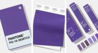
Due to the cultural significance of the colour of the year, there will be a frenzy of media activity. Articles and blogs will be written, videos will be filmed and the colour will trend on social media, as the worlds of graphic design and packaging, fashion, beauty and home décor, to name but a few, launch new products to coincide with the new colour. Last year, Pantone unveiled Ultra Violet (Pantone 18-3838) as its colour of the year, revealing it to be a “dramatically provocative and thoughtful purple shade” which “communicates originality, ingenuity, and visionary thinking that points us toward the future”.
What does Pantone have in store for us in 2019? As yet, we still don’t know. But we can try to fill in some of the gaps until then.
What is the Pantone Colour of the Year?
The Pantone Colour of the Year was created by the Pantone Color Institute in 2000 to guide creative professionals. Used as a guide and an inspiration for a number of creative industries such as apparel, industrial design, marketing and art, the colour of the year has been licenced to a variety of products from cosmetics to consumer electronics
Colour trends are analysed and studied throughout the year to help the Pantone Colour Institute make their decision on the next Pantone Colour of the Year.
They will evaluate all aspects of society – marketing, fashion, social media and even politics. The Colour of the Year has become increasingly influential in the world of brand marketing and design.
When is the Pantone Colour of the Year 2019 announced?
The Pantone Colour of the Year for 2019 will be announced in December, as it is every year. Pantone has yet to confirm what the exact date will be, so until then we have to wait with bated breath.
Why is the Pantone Colour of the Year important?
Pantone is a major influencer in the world of colour design and trends. The Colour of the Year provides strategic direction for the world of trend and design, which reflects the Pantone Colour Institute’s year-round work collaborating with top designers and brands. Brands such as Tiffany have gone as far as trademarking their specific Pantone colour (1837, not commercially available).
Around the world, individuals and businesses are becoming more and more fascinated with colour and are eager to tap into its ability to convey deep messages and meanings.
Designers and brands should, according to Pantone, feel empowered to use colour to inspire and influence.
As Laurie Pressman, vice-president of the Pantone Colour Institute, adds: “The Pantone Colour of the Year has come to mean so much more than ‘what’s trending’ in the world of design; it’s truly a reflection of what’s needed in our world today.”
When did the Pantone Colour of the Year start?
The Pantone Colour of the Year began life in 2000 when the very first Pantone Colour Institute’s chosen hue was Cerulean (Pantone 15-4020).
That colour, and that moment in time, was further evidence that the Pantone Colour Institute members are the worldwide experts for all things colour-related.
For 19 years, Pantone’s Colour of the Year has influenced product development and purchasing decisions in multiple industries, including fashion, home furnishings, and industrial design, as well as product packaging and graphic design.
Pantone was established in New York in the 1960s, and the Pantone Color Institute is now the world’s leading consultants on colour, collating trend information globally and communicating through trend forecasts. Their knowledge and expertise of colour is unrivalled.
Who chooses the Pantone Colour of the Year?
Every year, Pantone hosts a number of secret meetings where representatives of various nations’ colour standard groups will come together.
After several days of presentations and debate, the Pantone Colour Institute will choose a colour for the following year.
The selection process is given a great deal of consideration and trend analysis, and Pantone’s colour experts comb the world and tap into the zeitgeist looking for new colour influences.
That can include the film and entertainment industries, fashion, design, new lifestyles, socio-economic conditions, art collections and even popular travel destinations.
Influences may also derive from new technologies, textures, materials and effects that impact colour, relevant social media platforms and sporting events that capture worldwide attention.
This is true for the recently released Metallic Shimmers Collection which drew inspiration from consumer electronics.
Leatrice Eiseman, the executive director of the Pantone Colour Institute and the person ultimately responsible for the Colour of the Year, has said: “I look for ascending colour trends, colours that are being used in broader ways and broader context than before.”
What will the Pantone Colour of the Year be in 2019?
What the actual colour of the year will be is a hot topic for debate at VeriVide. Our top three suggestions are Jester Red (Pantone 19-1862), Mango Mojito (Pantone 15-0960) and Aspen Gold (Pantone 13-0850).
There has been a particular buzz around yellow colours this year due to their ubiquity in fashion and home textiles, ceramics and art. In fact, VeriVide colour experts have been experimenting with bright yellows and darker mustard tones in apparel and home to varying degrees of success. Further exploration of darker yellows will continue into the Autumn and Winter months.
What are the past Pantone Colours of the Year?
The Colour of the Year 2019 will be the 19th colour unveiled by the Pantone, and excitement levels are on a high until the big reveal in December.
But what were the colours that preceded it? Here we give you a rundown of all the colours from 2018 to the very first in 2000.
Past and present Pantone Color of the Year:
2018 – Ultra Violet (Pantone 18-3838)
2017 - Greenery (Pantone 15-0343)
2016 - Rose Quartz (Pantone 13-1520) & Serenity (Pantone 15-3919)
2015 – Marsala (Pantone 18-1438)
2014 – Radiant Orchid (Pantone 18-3224)
2013 – Emerald (Pantone 17-5641)
2012 – Tangerine tango (Pantone 17-1463)
2011 – Honeysuckle (Pantone 18-2120)
2010 – Turquoise (Pantone 15-5519)
2009 – Mimosa (Pantone 14-0848)
2008 – Blue Iris (Pantone 18-3943)
2007 – Chili Pepper (Pantone 19-1557)
2006 – Sand Dollar (Pantone 13-1106)
2005 – Blue Turquoise (Pantone 15-5217)
2004 – Tigerlily (Pantone 17-1456)
2003 – Aqua Sky (Pantone 14-4811)
2002 – True Red (Pantone 19-1664)
2001 – Fuchsia Rose (Pantone 17-2031)
2000 – Cerulean (Pantone 15-4020)
For more information on When will Pantone’s Colour of the Year 2019 be announced and why is it important? talk to VeriVide
Welcome back to FindTheNeedle.
Not registered? Get listed — most visitors don't have an account yet.
List your company on FindTheNeedle.