

6 Inspiring Ice Cream Packaging Designs
You scream, I scream, We all scream for Ice Cream!
Lets hope the UK weather starts hotting up so we can consume some more ice cream. In the mean time, why not dribble over these yummy flavoured ice creams whilst admiring the great packaging and branding!
1. La Strada, Contemporary Gelato – designed by Cohnandjansen
We love this fun vibrant packaging Cohnandjansen designed for La Strada. Each flavour of gelato has its own unique bold pattern.
“Our brand mission: evolve from eating ice cream to wearing the ice cream packs on the street. We created the first prêt-a-porter gelato meant to turn the sidewalk into a catwalk and the product into a fashion icon. Our range becomes a unique street fashion collection with multiple fabric patterns inspired by our intense ice cream flavors.”
2. Awfully Nice – designed by Calum Middleton
3. Selva Nevada – designed by Siegenthaler & Co
How beautiful are the illustrations on the packaging for these botanically inspired ice creams?
“When we tried the products we were immediately transported to the jungle, and we wanted to convey the same feeling through our packaging. We decided to illustrate the Colombian fauna and flora around the packaging in a style inspired by Henri Rousseau. The result: Colombia’s jungle in ice cream form.” Siegenthaler & Co
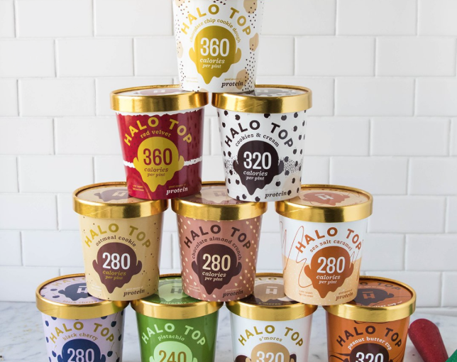
4. Halo Top – designed by Peck & Co.
This fun, vibrant packaging design by Peck & Co. for Halo Top caught our eye. Halo Top is a healthy ice cream that is low in calories and sugar and high in protein, the design of the packaging needed to reflect the brand in a fresh, fun way. The low-calorie point hits centre stage in the packaging and is clear for consumers, whilst the golden lid not only ties in to the brands name but also catches consumers eyes when shopping.
5. Gorky Park Ice Cream – designed by Creative Agency: Just Be Nice Studio
When Creative Agency, Just be Nice Studio’s was tasked with creating a new packaging design for these ice creams that have been sold in Moscow’s Gorky Park for decades, the designers decided to reflect the Park Life into the graphics.
We love the bright colours used in the new packaging.
6. Fiasco Gelato – designed by Fiasco Gelato Shop
Simple, honest and filled with passion is the ethos of Fiasco Gelato, which has translated well to their packaging.
“At Fiasco much of our success stems from the support of our customers who share the same values as us; artisan handcrafted work that is filled with love, passion, and creativity. Our goods are made with attention to detail and quality, making it natural for us to create packaging designs that share who we are.”
We love the fact that the transparent material of the jars allows the rich colours of the ice cream to shine through and the twist off lids make these jars reusable and environmentally friendly.
Happy Scooping!
For more information on 6 Inspiring Ice Cream Packaging Designs talk to Carrier Bag Shop