Sign In

Manufacturers and designers use colour references and colour standards such as Pantone to select and specify colour by a reference number which allows them to predict the appearance of the colour after printing.
The Challenge
By using existing colour ranges, designers save precious time in the first stage of colour specification. However, colour is rarely reproduced exactly on a printed material as it is presented on the monitor even with the guidance of colour standards. The first challenge to overcome is the calibration of the monitor, the second the ability to add the correct colour data into your design programmes and the third the variation of the printer type and the material used.
Pantone/ X-rite can assist with controlling these three challenges by providing monitor calibration devices, colour data integration and simulations of colour on multiple materials. All will be discussed in a later article whereas here we will explain the different ink types and the best Pantone books to use when designing for those ink types.
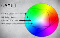
The main cause for the difference in actual colour produced is that the colour gamut of computer monitors in RGB or s RGB surpasses the capability of the printer especially if it has only CMYK inks. Designers’ need to specify colour before and after printing has created the development of colour guides that indicate spot to process colours.
Many designers remain bewildered in identifying the difference between spot and process colours. As we receive many requests for more clarification, we decided to collect the most common questions about spot and process colours and how you can use them with the right Pantone guides.
Spot vs Process Colours
So, let’s start from the fundamentals. What is the difference between spot and process colours?
Spot colours, or solid colours as they are often known as, are formulated from pure base inks which can be used singularly or mixed. For example, mixing a blue and a yellow colour produces green just as in mixing paint and with precise additions of each colours, many solid colours can be produced. Pantone has developed its own formula of ink mixing beginning with 18 pure base inks which are manufactured under license, creating the spot colours in the Pantone Matching System (PMS).
The ink recipes are referenced in the popular Formula Guide Set under a printed representation of the colour.
Spot colour printing features a larger colour gamut than process colours – see illustration below and many company logos can only be accurately reproduced using Spot colours. Unfortunately, the use of spot colours can be expensive therefore are generally used where colour accuracy is crucial.
For more information on Spot to Process Colours: What is the difference and how to use them? talk to VeriVide
Enquire Now
List your company on FindTheNeedle.